Android 13 is the epitome of iteration. After the surprise release of Android 12, Google decided to take a year off from innovation, focusing on stability and privacy for this year’s mobile software update. While Android 13 may not have as many new features as Material You, it is still a solid update for the best Android phones.
Permissions have been improved, particularly notifications. Android now mimics iOS by asking if you want an app to send you notifications the first time you launch it after installation. Other enhancements, such as notification runtime permissions, may appear minor, but they are nonetheless significant. Material You’ve advanced a little, you can set language preferences per app, and privacy remains a priority with features like an iOS-style photo picker — despite Google still trailing Apple in terms of privacy.
Android 13 release date
On August 15, 2022, Google released the stable Android 13 update to the public. The update, along with the source code, was made available to the company’s Pixel phones. Google’s Android 13 Developer Preview program began in February 2022, and much has changed since then, leading up to the final release in August 2022. Here’s a quick look at Google’s original roadmap for the Android 13 beta program:

Where can I get the Android 13 Beta?
You can manually install the correct package for your eligible device from the list and test the new software.
Android 13 design and UI
Material You
Google launched Material You in Android 12, ushering in a massive new design language akin to Material Design in 2014. Much has changed since then, but Material You in Android 13 continues to improve. You may still find the change contentious, as many do. However, this is Google’s vision, and it is carried over into this OS version.
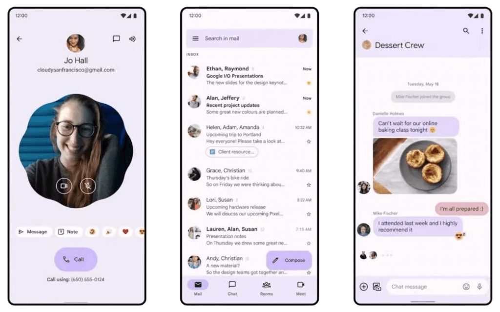
More color options are extracted from your wallpaper in Android 13. Material You on Android 12 felt a little uninspired at times, where I frequently chose one of the preset colors to get a look I liked. I’m glad Android 13 went a step further with options, giving me more options without forcing me to change my wallpaper. These options can be found in the Wallpaper & Style section of the Settings menu or by long pressing on the home screen.
Material You also introduced themed icons, which were limited to Google apps and stood out like a sore thumb in your app drawer alongside regular icons. However, Google has recently expanded the themed icons to third-party apps. While it is useful in practice for creating a uniform appearance, I am skeptical of its widespread adoption. Android developers are slow to embrace many of Google’s initiatives, particularly because they must opt-in.
Google made a lot of changes with Material You, including some customization options that were available in Android 11. I’m hoping that next year’s Android 14 update brings back some of the features that Google has removed from recent versions, such as custom icon shapes.
System UI
The new media player in the notification shade is one that you may notice right away. It’s received a minor makeover, including new button placement and a new seek bar. In addition, unlike Android 12, the media player is always expanded. Album art now takes center stage in the background as well, but only in apps that support it. Some may only provide you with a single color. Spotify, on the other hand, looks great as a result of this change.
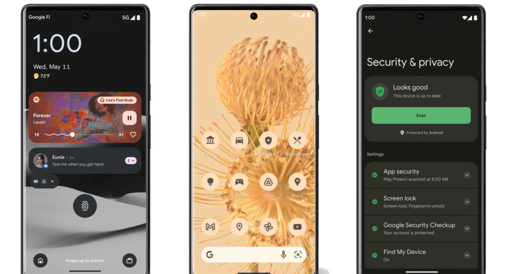
While not new to Android, this change was made in Android 12L, and it allows you to move the lock screen clock to the corner, right where it goes when you have notifications. I don’t mind the choppy clock in the center of my lock screen, but if you do, Android 13 allows you to change it with the Double-line clock toggle in Settings > Display > Lock screen.
Pixel Launcher
The Pixel Launcher hasn’t changed much visually, but Google has messed with the search functionality yet again. There are two ways to search for items in the launcher. The Google widget on the home screen primarily serves as a search engine, but it can also surface apps as you type.
The app drawer search is more similar to iOS, where you can search for apps, perform web searches, look for things on your device, and search the Play Store. However, the fact that this is hidden in the app drawer rather than the main Google widget on the home screen does not sit well with me. I would have preferred that Android 13 combine the two search functions into a single location. It works well on iOS and I believe it would work similarly on Android. Google has a habit of making things overly complicated, and this is yet another example of that.
Android 13 privacy and security
Notifications permissions
Android now has runtime notification permissions similar to iOS. When you launch an app for the first time, it now asks for permission to send you notifications. This is a very welcome change. While managing notifications on Android is much easier and more robust than on iOS, I prefer Apple’s method of requiring apps to obtain your permission to send notifications.
Photo picker and media permissions
Continuing in the permissions theme, Android 13 now requires apps to request access to photos, video, or audio separately, rather than all at once, as previously. Google also introduced a new photo picker, similar to the one found on iOS. When an app asks for access to your photos, the system displays a list of your media, and whatever you whitelist is passed to the app.
In theory, it sounds fantastic, but in practice, very few apps currently support the photo picker; adoption is likely to be slow, if at all. This is something Google must enforce if it is serious about Android privacy. So far, I believe Apple and iOS are far ahead of Google in terms of privacy, and Google does not appear to be eager to catch up.
Task Manager
When you have foreground apps running, the task manager appears at the bottom of the Quick Settings menu. You can kill any of those apps at any time, but be aware that doing so may result in problems if you close the wrong one (such as your music player while you have music going). Google has long resisted adding a task manager to Android, but 2022 will be the year it finally listens — and puts an end to those dangerous task killer apps.
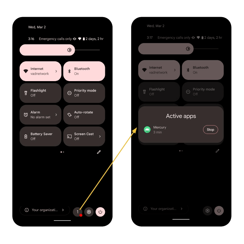
However, the task manager only applies to foreground apps and services. This change appeals to me because it replaces the old way of doing things. Previously, Google required apps to notify users when they were running in the background. The solution was a large and unappealing notification that sat in the notification shade. This could become annoying if you used apps like Tasker on a regular basis. This notification will still appear, but you can now dismiss it.
Android 13 miscellaneous changes
- Per-app language preferences
- Native QR code reader
- Clipboard editor
- Connectivity (Wi-Fi 7)
Android 13 pros
- Focus on stability
- Permissions changes
- Material You advancements
- Per-app language support
- Privacy and security enhancements
Android 13 cons
- A rather small update compared to past versions
- Media audio switcher doesn’t support Cast
- New media player isn’t pretty
- Pixel Launcher search is confusing

